Welcome To My New Lighter And Brighter Look
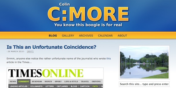
Welcome ladies and gentlemen to the new look colinseymour.co.uk:

As you can see, we're essentially the same as the last theme, just we're now sporting a lighter colour scheme with a lot more blue and white with a hint of yellow. No more brown.
I've also moved the whole site across to a different server, so things may be slightly broken but hopefully I've already taken everything into account, but we'll see.
I hope you like the new look and hopefully better responsiveness too.