What Were They Smoking?
What on earth were the London Olympic committee smoking when they thought the new London Olympic 2012 logo was a good one:
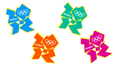
This hideous design (<sarcasm>available in 4 great colours</sarcasm>) was revealed today.
The best bit, International Olympic Committee prez Jacques Rogge was quoted:
This is a truly innovative brand logo that graphically captures the essence of the London 2012 Olympic Games - namely to inspire young people around the world through sport and the Olympic values. Each edition of the Olympic Games brings its own flavour and touch to what is now well over a century of modern Olympic history; the brand launched today by London 2012 is, I believe, an early indication of the dynamism, modernity and inclusiveness with which London 2012 will leave its Olympic mark.
Innovative? I don't think so. Will it leave a mark? Damn right, as one of the most disgusting Olympic logos I've ever seen. Sorry Sebastian Coe... I once admired you when I was an eager young 800m athlete, but I think you've got it wrong with this one.