Welcome To Version 4.0
If you're seeing this, then the move across to my new hosting company was a success.
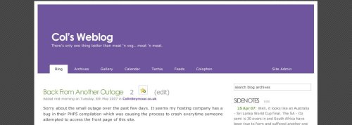
Welcome to version 4.0 of my website. As you can see we're sporting a lovely red, white and purple look with a flexible content area (it gets bigger and smaller as you resize your browser) with a "floating sidebar". Let me know what you think. The only thing I'm not sure about is the logo I created. I'm not sure if it fits in with the rest of the look of the new design.
As I always do, a screenshot of how things used to look:
